Team
- Myself
Design Lead
Research Lead
Analytics Lead
Marketing Lead - Abbey S
Product Lead - Catherine W
Engineering Lead
My Process
- Rapid Prototyping
- App Store Optimization
- Marketing Design
- Analytics Synthesis & Forecasting (Sheets)
- Feature Prioritization (Kanban)
Results
- App Store rating of 3.5
(up from 1.8) - Active users up 174%
- Sales up 210%
- Conversion rate up 211%
BluePrintz approached me at TC Design Forge with a compelling market fit and an acute user experience need.
Four years earlier, BluePrintz zeroed in on an opportunity to empower customers during their home design process, particularly in making exterior design choices. With the increasing complexity and cost of home renovations, there was a growing need for a solution that could streamline the decision-making process and provide users with confidence in their design selections. By leveraging technology and innovative design principles, BluePrintz aimed to fill this gap in the market and revolutionize the way users visualize and conceptualize their dream homes through a user-friendly iOS app.


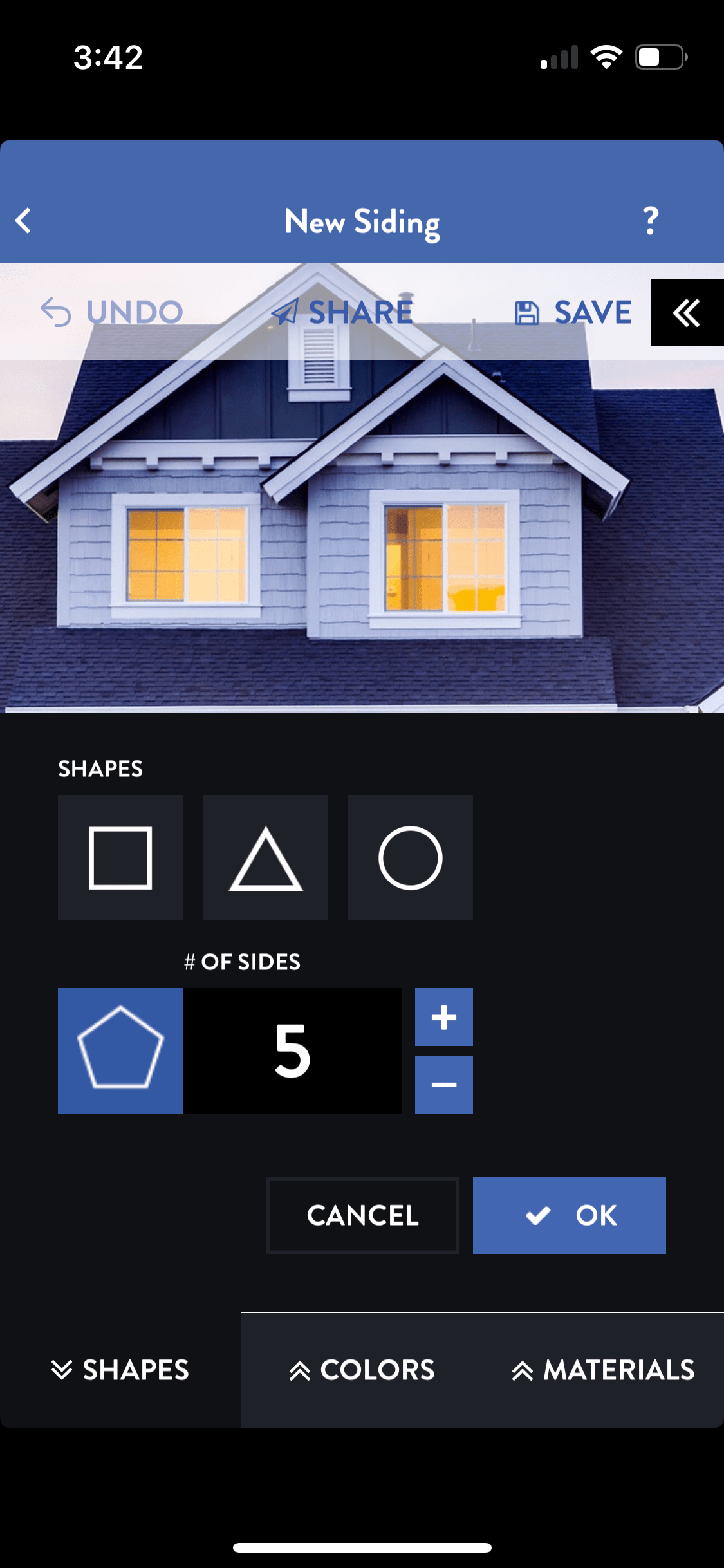
‘Before’ samples of the app UI prior to my involvement.
The Opportunity
Despite the app’s unique and useful functionality, it was struggling to attract and retain users. The app had a low rating of 1.4 on the App Store, and a conversion rate of only 0.95%. The BluePrintz team knew they needed to improve the app’s user experience to increase its popularity and success.
This presented a compelling opportunity to revitalize the app through a collaborative effort, focusing on user needs and driving business growth. BluePrintz not only needed a consultant, they wanted a true partner to share their successes and risks.
We jumped at the opportunity, I drafted a partnership agreement and our Joint Venture officially began.
The Hunch
We believed that by improving user experience, addressing pain points, and implementing data-driven strategies, we could significantly enhance user engagement, leading to a more successful app.
The core functionality of BluePrintz — visualizing exterior design options for homes — held immense potential. Collaborating with the product stakeholder, we identified opportunities to offer users greater flexibility in selecting textures and colors for users’ home exteriors, thereby providing a more personalized and immersive experience. However, the feasibility and user value of implementing such features remained uncertain, requiring further exploration and investigation into the viability of this hunch.
The Approach
To address the hunch and validate proposed enhancements, a systematic approach was adopted, encompassing user research, design iteration, and collaboration with stakeholders.
Beginning with an expert UX analysis of the existing experience and user feedback, I led the venture in formulating and executing a comprehensive design strategy prioritizing user needs and goals:
- Goal Setting and Alignment: Establish both short-term and long-term goals for the app to ensure alignment with user needs and stakeholders.
- Data & Analytics: Develop an analytics dashboard to monitor progress towards goals, gather user feedback (VOC), and forecast future performance.
- Prioritization: Create a product backlog and collaborating with product prioritized features based on their potential impact (estimated effort vs. value).
- Content and Marketing: Enhance product page content, keywords, and marketing materials to attract a wider audience and showcase the app’s benefits.
- User-Centered Design: Conduct qualitative user research to help understand user needs and pain points. Prototype and testing new design solutions based on research findings ensured an improved user experience.
- Iterative Development: Continuous refinement of prototypes based on user testing feedback to ensure the final product addressed user needs effectively.
- Technical Collaboration: Establish clear communication lines with developers to ensure design intent was translated effectively into the final app and that technical constraints were addressed with a holistic, collaborative, user-centered approach.
- Future Vision: Develop a forward-looking design strategy and aesthetic aimed to generate excitement and guide future app development.
Qualitative usability testing (findings, recommendations & script) was conducted on an usually small sample size (2 vs NNG’s recommendation of 5) to help evaluate the impact of introducing enhanced customization features and usability improvements. Additionally, close collaboration with the development team ensured alignment between design intent and technical implementation, facilitating the seamless integration of new features into the app.
The Outcome
The outcomes of the collaborative efforts were transformative, exceeding initial expectations and laying the foundation for future innovation. Significant achievements, including a notable increase in user ratings, conversion rates, and revenue, underscored the success of the Joint Venture. Furthermore, the successful implementation of enhanced customization features validated the team’s hunch. The app’s enhanced functionality and usability paved the way for continued growth and success.


These efforts yielded some solid results across several key metrics:
- App Store Rating: Increased to 3.5 stars, exceeding the initial target of 3.
- Conversion Rate: Achieved an 211% increase, surpassing the original 0.95% and reaching a 2.00% conversion rate.
- Sales: Average monthly sales up 210.48%
- Active Users: Monthly active devices up 173.77%
- Improved In-App Onboarding: A sleek how-to video helped transform onboarding into a user-friendly experience with intuitive UI controls.
Future Considerations
Future opportunities include investigating the viability of allowing users choose a texture and then color it themselves, offering more flexibility and scalability.
The product backlog prioritizes several high-demand, high-impact features for near-term implementation. Following these, a dedicated phase focused on comprehensive UX and usability improvements is planned. This focus on user-centered design is expected to contribute to a significant long-term improvement in the app’s user rating, resulting in further improvements to conversion rate and active users.
